Responsive Font sizes (rfs) 
See also

README.md 
RFS (simply the abbreviation for Responsive Font Size) is a font size engine which automatically calculates the appropriate font size based on the dimensions of the browser viewport. It’s available in one of your favourite preprocessors or postprocessor: Sass, Less, Stylus or PostCSS.
RFS 


-
`!importantusage <#important-usage>`__
How does it work? 
-
Font sizes will rescale for every screen or device , this prevents long words from being chopped off the viewport on small devices
-
RFS will prevent the font size from rescaling too small so readability can be assured
-
Super easy to use, just use the
font-sizemixin (orresponsive-font-sizeproperty for PostCSS) instead of thefont-sizeproperty -
The font sizes of all text elements will always remain in relation with each other
RFS 
Installation 
RFS can be installed using a package manager (recommended):
-
npm:
npm install rfs -
yarn:
yarn add rfs -
bower (deprecated):
               bower


               install


               rfs


               --save
Copy/paste (not recommended):
The source files can also be downloaded manually and used in a project. This method is not recommended because you lose the ability to easily and quickly manage and update RFS as a dependency.
Usage 
In the following examples, this folder structure is assumed (you will probably just use one pre/postprocessor):
project/
├── postcss/
│   └── main.css
├── less/
│   └── main.less
├── node_modules/
│   └── rfs
│        └── ...
├── sass/
│   └── main.sass
├── scss/
│   └── main.scss
└── stylus/
    └── main.styl
Sass 
.scss
syntax:
// scss/main.scss

@import "../node_modules/rfs/scss";

.title {
  @include font-size(4rem);
  // or
  @include responsive-font-size(64px);
  // or
  @include rfs(64);
}
.sass
syntax:
// scss/main.scss

@import "../node_modules/rfs/sass"

.title
  +font-size(4rem)
  // or
  +responsive-font-size(64px)
  // or
  +rfs(64)
PostCSS 
// postcss/main.css

.title {
  responsive-font-size: 4rem;
  // or
  rfs: 64;
}

// Handle postcss afterwards (see examples folder for PostCSS example)
Less 
// less/main.less

@import "../node_modules/rfs/less";

.title {
  .font-size(4rem);
  // or
  .responsive-font-size(64px);
  // or
  .rfs(64);
}
Stylus 
// stylus/main.styl

@import "../node_modules/rfs/stylus";

.title
  responsive-font-size(64px)
  // or
  rfs(64)
Note the
font-size
mixin can not be used to set the font size. That
is because a
font-size()
mixin would override the
font-size
property. See
129#issuecomment-477926416
for more info.
Generated css 
.title {
  font-size: 4rem;
}

@media (max-width: 1200px) {
  .title {
    font-size: calc(1.525rem + 3.3vw);
  }
}
If you’re using Webpack, you can simplify the
@import
using the
~
prefix:
@import "~rfs/scss";
@import "~rfs/sass"
@import "~rfs/less";
@import "~rfs/stylus"
Visualisation 
If you wonder how the font sizes are rescaled, wonder no more and stare at this graph which might clarify things a bit:

RFS visualisation 
Each color represents another font size being rescaled. For example:
.title {
  @include font-size(40px);
}
This is the green line. A font size of
40px
stays
40px
in
viewports with a size larger than
1200px
. Below
1200px
, the font
size is rescaled and at viewport of
360px
, the font size is about
27px
. Note that every font size is generated in a combination of
rem
and
vw
units, but they are mapped to
px
in the graph to
make it easier to understand.
Configuration 
RFS works out of the box without any configuration tweaks, but if you feel the urge to go loco and fine tune the way font sizes are rescaled, you can:
Base font size (unit in
px
or
rem
)
-
SCSS, Sass & Stylus:
$rfs-base-font-size -
Less:
@rfs-base-font-size -
PostCSS:
baseFontSize
The option will prevent the font size from becoming too small on smaller screens. If the font size which is passed to RFS is smaller than this base font size, no fluid font rescaling will take place.
Default value: ``1.25rem``
Font size unit (
px
or
rem
)
-
SCSS, Sass & Stylus:
$rfs-font-size-unit -
Less:
@rfs-font-size-unit -
PostCSS:
fontSizeUnit
The output font size will be rendered in this unit. Setting it in
px
will disable the ability for users to change the the font size in their
browser.
Default value: ``rem``
Breakpoint (in
px
,
em
or
rem
)
-
SCSS, Sass & Stylus:
$rfs-breakpoint -
Less:
@rfs-breakpoint -
PostCSS:
breakpoint
Above this breakpoint, the font size will be equal to the font size you passed to RFS; below the breakpoint, the font size will dynamically scale.
Default value: ``1200px``
Breakpoint unit (
px
,
em
or
rem
)
-
SCSS, Sass & Stylus:
$rfs-breakpoint-unit -
Less:
@rfs-breakpoint-unit -
PostCSS:
breakpointUnit
The width of the max width in the media query will be rendered in this unit.
Default value: ``px``
Factor (number) 
-
SCSS, Sass & Stylus:
$rfs-factor -
Less:
@rfs-factor -
PostCSS:
factor
This value determines the strength of font size resizing. The higher the factor, the less difference there is between font sizes on small screens. The lower the factor, the less influence RFS has, which results in bigger font sizes for small screens. The factor must me greater than 1.
Default value: ``10``
Rem value (number) 
-
SCSS, Sass & Stylus:
$rfs-rem-value -
Less:
@rfs-rem-value -
PostCSS:
remValue
The value of
1rem
in
px
. The value of
1rem
is typically
16px
but if the font size is changed for
html
the value of
1rem
changes. This variable can be used to change the default value
but be careful with it because changing it could lead to unexpected
behaviour, for example if additional CSS is loaded which expects
1rem
to be
16px
.
Default value: ``16``
Two dimensional (boolean) 
-
SCSS, Sass & Stylus:
$rfs-two-dimensional -
Less:
@rfs-two-dimensional -
PostCSS:
twoDimensional
Enabling the two dimensional media queries will determine the font size
based on the smallest side of the screen with
vmin
. This prevents
the font size from changing if the device toggles between portrait and
landscape mode.
Default value: ``false``
Class (boolean) 
-
SCSS, Sass & Stylus:
$rfs-class -
Less:
@rfs-class -
PostCSS:
class
RFS can be enabled or disabled with a class. There are 3 options:
-
falseNo extra classes are generated. -
disableWhen the the disable classes are generated you can add the.disable-responsive-font-sizeclass to an element to disable responsive font sizes for the element and its child elements. -
enableRFS is disabled by default in this case. The.enable-responsive-font-sizeclass can be added to an element to enable responsive font sizes for the element and its child elements.
Default value: ``false``
Safari iframe resize bug fix (boolean) 
-
SCSS, Sass & Stylus:
$rfs-safari-iframe-resize-bug-fix -
Less:
@rfs-safari-iframe-resize-bug-fix -
PostCSS:
safariIframeResizeBugFix
Safari doesn’t resize its font size in an iframe if the iframe is
resized. To fix this
              min-width:


              0vw
can be added and that’s what
happens if this option is enabled. See
#14
.
Default value: ``false``
!important usage 
By setting a second parameter to true,
!important
is added after the
font-size value. (Example is in
scss
)
.label {
  @include responsive-font-size(2.5rem, true);
}
CSS:
.label {
  font-size: 2.5rem !important;
}

@media (max-width: 1200px) {
  .label {
    font-size: calc(1.375rem + 1.5vw) !important;
  }
}
Best practices 
-
Don’t set RFS on the
htmlelement, because this influences the value ofremand could lead to unexpected results. -
Always set your line-heights relative (in
emor unitless) to prevent interline issues.
Browser support 
RFS is supported by all browsers that support media queries and viewport units . In browsers like IE8 or older, the font size will be set but the fluid rescaling will be disabled. A list of the most popular browsers that support RFS: - Chrome - Safari - Opera - Firefox - Edge - Samsung Internet - UC Browsers - IE >= 9
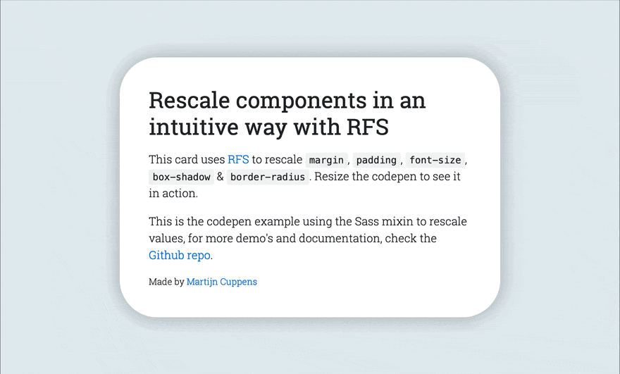
Demos 
Creator 
Martijn Cuppens
Copyright and license 
Code released under the MIT license .